Whoop There it is — Data Intensive Overhaul of Whoop
Presenting my fitness data in a data intensive way to make me work out harder and understand myself better
So, we’ve been taking the applications we love and imagining how they can be improved by injecting them data intensive features.
Data intensive? Sounds scary. What even is that? Why is there a warthog on its O’Reilly book?
The hard part of Data Intensive features like the ones we are going to show you below isn’t making a graph or a chart or any front end feature, it is building a back end that can dynamically present the data the front end needs to performantly serve those features.
Let’s show you what we mean by talking about the Whoop app.
We looked at two different parts of the app that could be made more exciting with data intensive features.
- The first was the workout experience.
- The second was the weekly recap.
Working out alone with my mates!
We imagined what it could be like in the Whoop app to work out with your friends. From cycling alone in my garage dreaming of warmer months, to cycling alone in my garage with my friends alone in their garages.
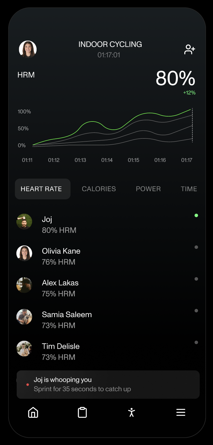
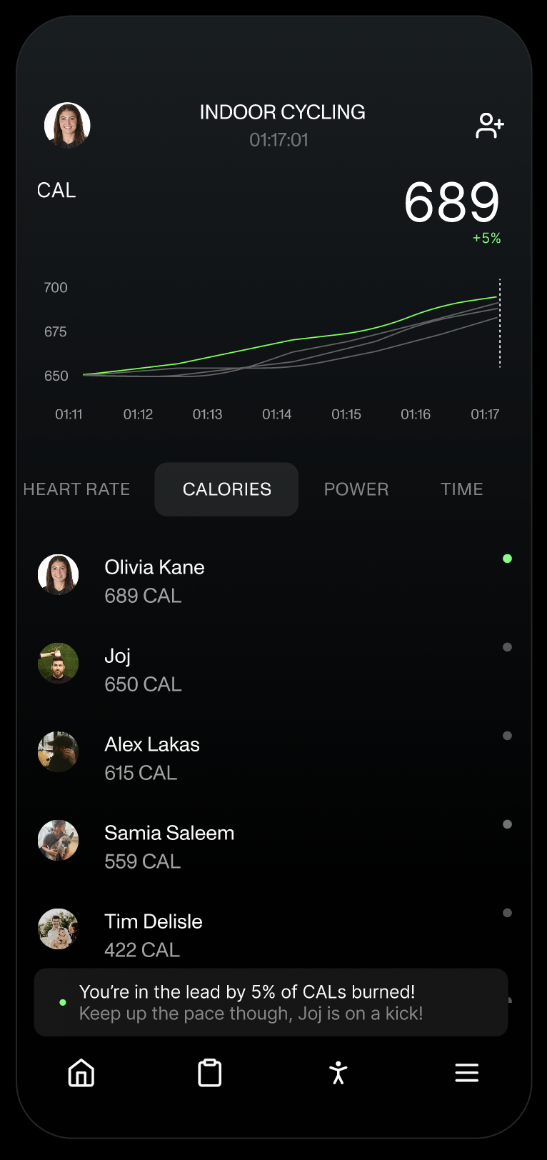
First, how cool is it that I can see how my mates are doing? That I’m definitely trying the hardest out of anyone on our ride (is that a good thing? why is it so easy for them?).
But lets look at the three data intensive features that this mock-up highlights:
- Dynamic graphs
- Leaderboards
- Competitive AI
Dynamic graphs and leaderboards
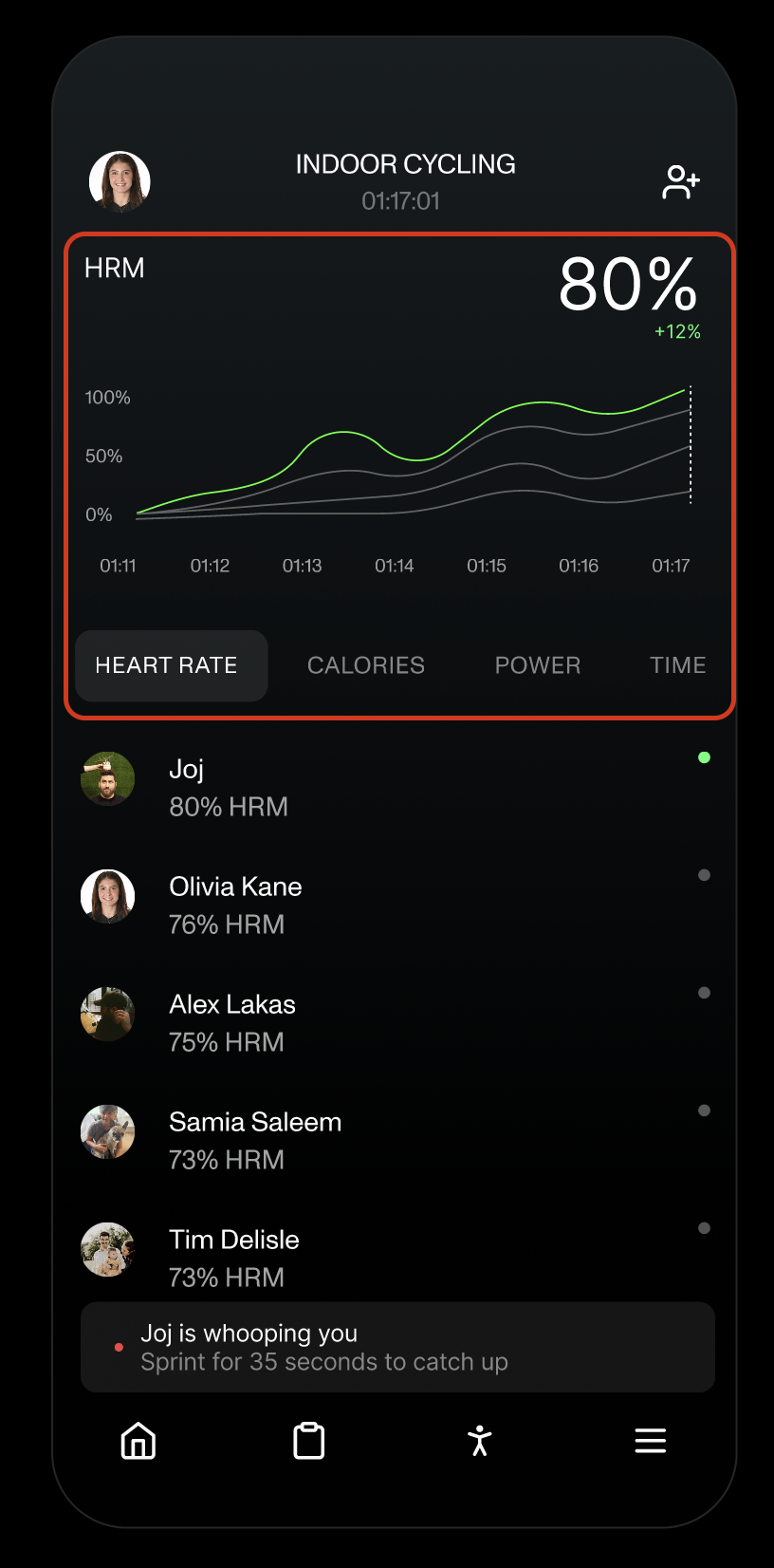
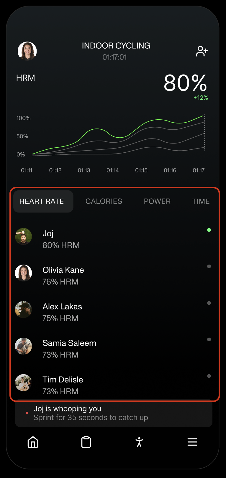
It is pretty easy to support a static visualization, but the more control you want to give your user, the more flexible a data infrastructure you need to support it. And the more control you give the user, the more insight they can get from the graph, and the more sticky the feature is. I don’t just want to see my heart rate over the past 5 minutes, I want to be able to choose the time frame, to see my average over the last 5 minutes, to see how my heart rate drives my power or my calorie burn.
And not only that, I want to see how I’m doing against my mates. Its not enough that I’m struggling, I want to see my mates struggle too! I want to see if I’m winning, or what I need to do to get to winning. I want to see a leaderboard!
All these features—dynamic filtering, toggling between variables, layering variables, selecting time-frames, grabbing averages and displaying them—are best supported by an analytical database-back end.
But you are likely recording all our heart-rates in a transactional or general purpose database.
Getting your data from your transactional system (e.g. the system that recorded all our heart rates) and the system that is allowing us to compare them live was traditionally where a one sprint project became a 2 quarter project that needs a data platform and data product team’s involvement.
But product teams can support these analytical databases themselves where needed.
We worked with such a product team at one of the largest gym franchises in the world to do this very thing! They used our open source data developer framework to define the data they needed, and the framework spun up the required infrastructure that:
- Ingest data from their heart rate source systems via API (Moose ingest APIs)
- Compared incoming data to a prescribed data model (Moose data models), sent compliant data through a streaming system (Redpanda) to enrichment functions (Moose functions, obviously)
- After enrichment, sending the data to a Clickhouse database
- Which then powered dynamic graph generation through a “consumption API” (Moose consumption APIs)
If you want to learn a bit more about how we did this, send me an email, join our slack channel, or try this yourself!
Competitive AI
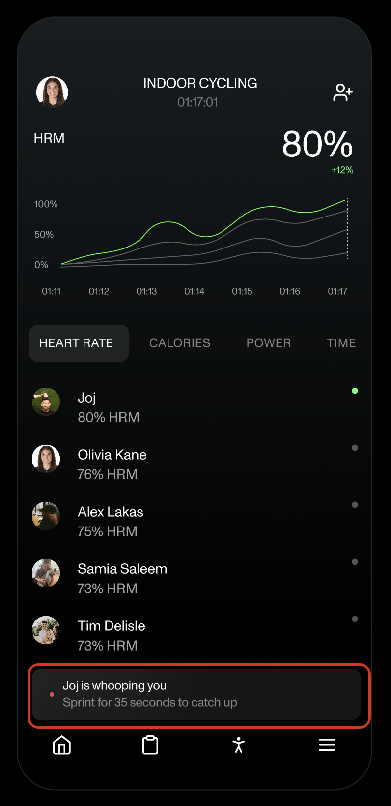
The other feature we were keen on was extending Whoop’s latest AI coach feature to be more of a live, shouting at you while you race kind of coach.
Here, we can show off something interesting—how can you make data available to an AI system that is trying to help Olivia beat me in our garage-cycling.
There are two main ways Moose interacts with AI. The first is by providing a vocabulary for the languages AI is already good at (here: Typescript, Python) that allows it to code with respect to your data (through data models, functions, etc). The second is by providing a rich context around data APIs that make the data useful for Retrieval Augmented Generation—that’s what’s in play in this example. Reach out to have a chat about AI and Data.
Dynamic personal reporting
One of my favorite parts of having a Whoop is the weekly email that Whoop sends me telling me how the independent variables in my life affect my fitness—i.e. I drank a few times this week, and that reduced the quality of my sleep.
The only downside to these reports is that they are static—a PDF, and I can’t fiddle with them. As a data nerd, that makes me spend way less time on them than I otherwise would.
We’ve reimagined them to be a little more dynamic—instead of sending a PDF, send me a link that takes me to my dynamic weekly charts:
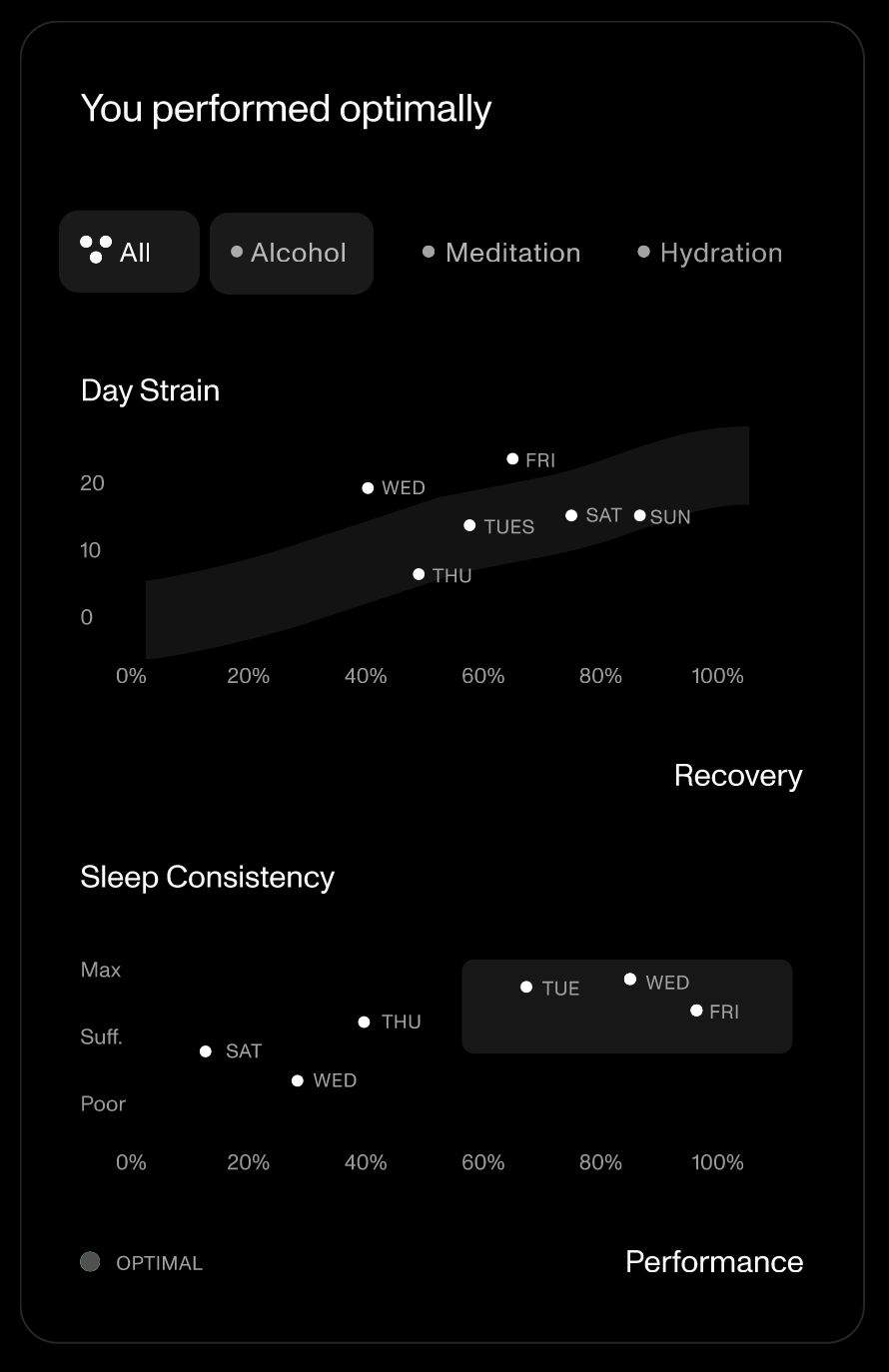
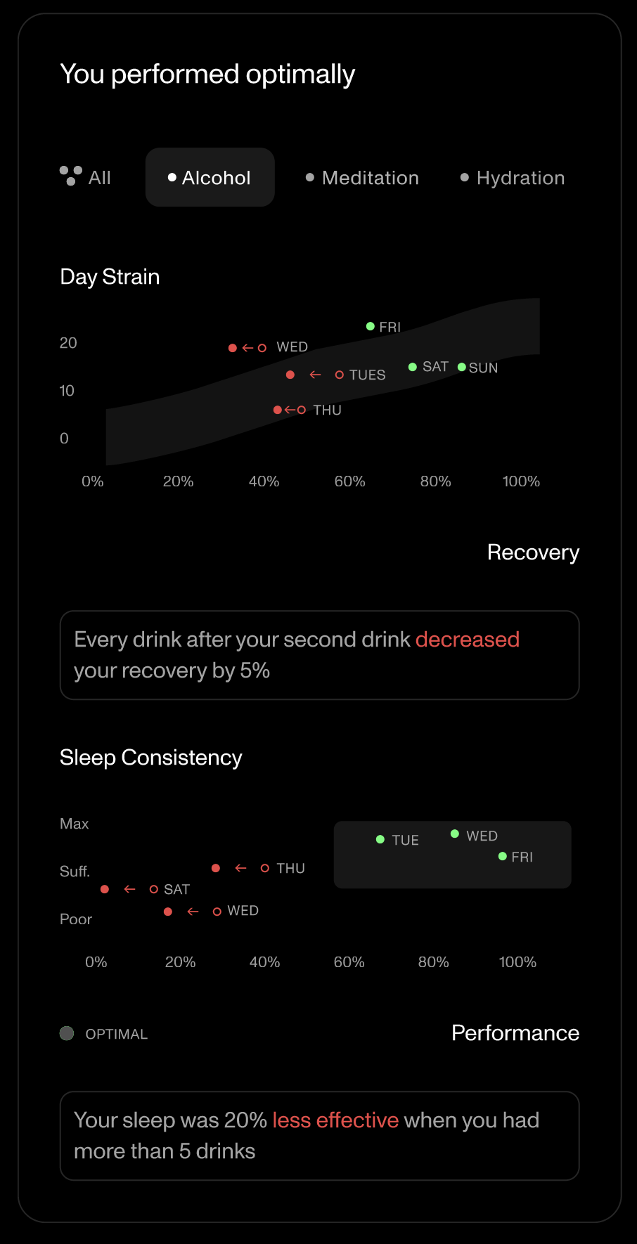
This could allow me to see my weekly performance. Like what’s currently shown. But then also to visually see the effect of alcohol on my performance (i.e. what my recovery would have been if I didn’t drink on Wednesday night), and of each other variable. To see what days were most affected by each variable. To see how variables coincided (e.g. did hydration negate the effect of alcohol?).
These dynamic features are, you guessed it, data intensive.
So we want to get our health telemetry, enrich it with the daily Whoop questionnaire responses, and throw it into a analytical database so that we can power dynamic querying of that data.
Again, this could be the one sprint prototype to 2 quarters of work to productionize moment. With Moose, though, the application team can retain control of the data processes needed to create these features, and build it themself.
If you want to learn a bit more about how we did this, send me an email, join our slack channel, or try this yourself!
A dash more AI
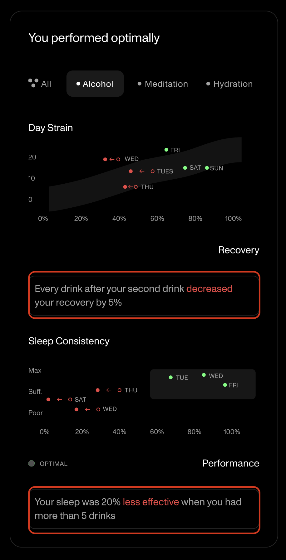
We also thought this could be a great place to further extend Whoop’s AI coach. Let the AI coach have access to my data, and tell me, in plain language, the effects of the variable I’m looking at. I certainly am less likely to have more than 5 drinks after being told the effect on my sleep!
This is just the beginning of the opportunity here, this could be the start of a conversation with the AI coach to reflect on my week.
To allow the AI coach to reflect on my week with me, I need to present my week’s data (and other supporting data) to the LLM, so it can access it and scald me for drinking on a Wednesday.
This would be developed similarly to the competitive AI described above. Let us know your thoughts, would love to chat!
Conclusion
We love our Whoops, and we think that a touch more data can take it to the next level. In redesigning the two screens above, we showed off three types of data intensive features:
- Dynamic graphs and figures
- Leaderboards
- Data informed AI
- About the redesign
- About what app we should look at next
- About this series in general
- If you want to learn more about building data intensive features into your application.